Color
Color range
We consolidate our space through color: green is our main color, our identifier and first-impact visual statement, it generates positive sensations, associated with human organic growth and its connection with new environments. In addition, it induces flexibility, adaptability and favors active action. It is of great importance that in all the communication materials you create, the color green is integrated to generate an immediate association with the university and the brand, in addition to creating an evident color domain.
Our range is also composed of the color yellow, which inspires the formation of new ideas and stands out among joy, intelligence and surprise. Complementarily, a range of purple adds to the palette to generate confidence, credibility and an immediate association with leadership and its technological innovation.
Main palette
Complementary palette
Grayscale
Gradients
Inspired by our chromatic range, the union between each color can be used as a gradient. These are the recommended uses that allow a pleasant visual balance, not saturated and that adapts to any use or support. Consider the color codes, the degrees of orientation and their combination. It is important that your gradients always start from the lower left corner to the upper right corner.
Gradient 1

Gradient 2

These gradient options (1 and 2) with greens are very subtle and therefore can be used on all global brand materials, giving a sense of greater depth and a delicate variation to the classic 2D.
+Recommended for:
- Outdoor backgrounds where you can see a person in front or when displaying text only.
- Social media platforms where it can also be used as a background or as an envelope.
- Works very well as a profile picture for social media with a white logo.
- Headers.
Gradient 3

This gradient works very well for branding applications of internal materials, such as individual programs of academic offerings, support materials for students and any material where you want to give a variation.
As it is part of the complementary palette, it is recommended to use it sparingly and to a lesser extent.
+Recommended fot:
- Internal materials.
- Web use.
- Very moderate use in social media with some background trying to differentiate a topic (e.g. a post from a global conference).
Gradient 4

+Recommended for:
- Social media when highlighting a post amongst many green images.
- Ads: our green color is important, but sometimes we can have ads where we integrate a little variation.
Gradient 5

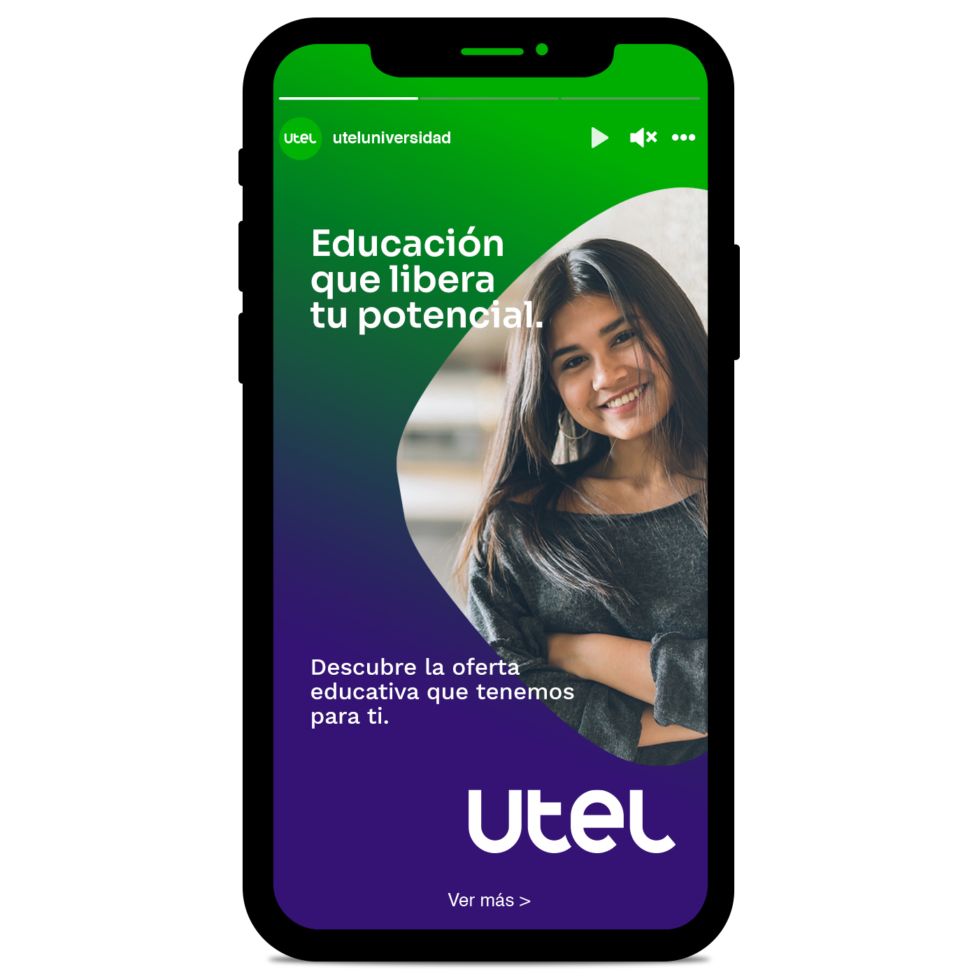
This gradient can be used as a background when highlighting people or important attributes, with colors in positive or in some applications where it is required to differentiate subtly with a white background.
+Recommended use:
- Its Hero use its one of the most powerful visuals when designing.
- Web use.
Non-permitted gradients
These are some examples of not permitted use of gradients in our communication. Consider not altering shapes, the integration of more than two colors or inconsistent radial adjustments.


Visuals
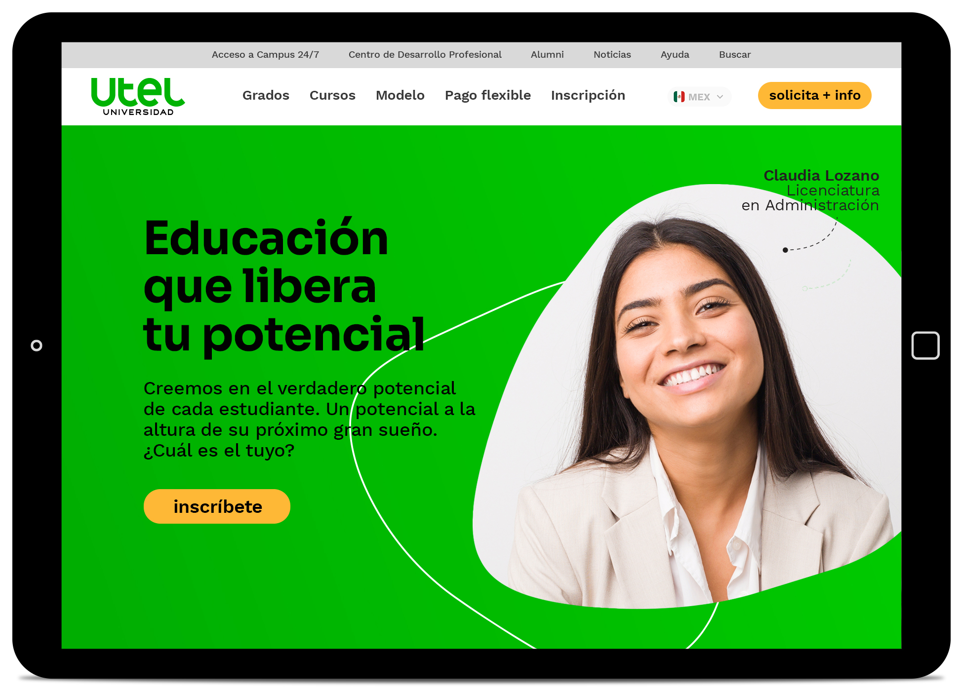
These are some examples of how to use colors and gradients in our communication.
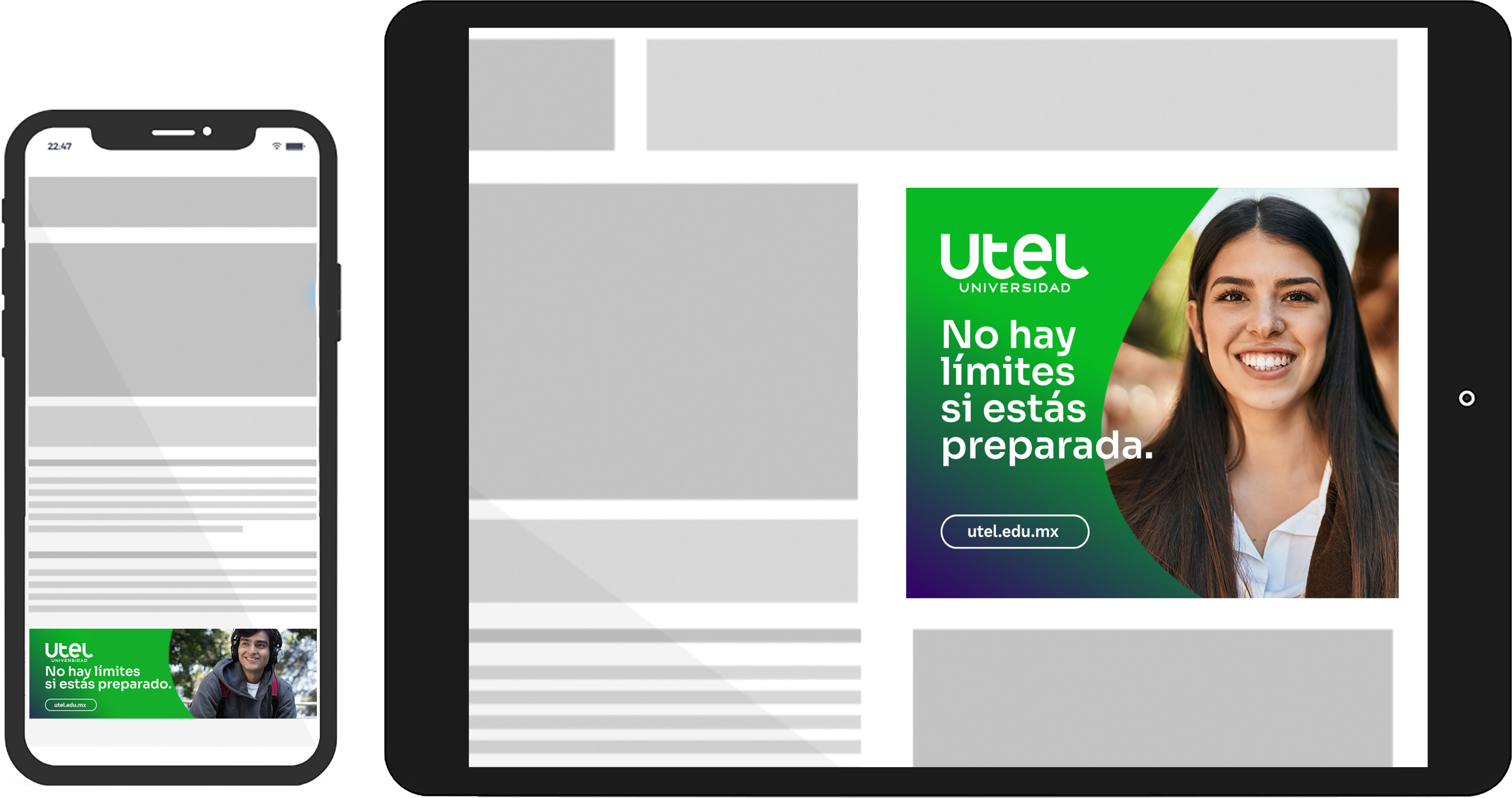
Example of using gradients in our ads.