Photo
Image style
Images bring our love brand to life:
They portray our personality and evoke emotions; they are a tangible reflection of our diversity and inclusiveness as a university.
This guide provides a simple overview of Utel's image style.
It includes permitted and non-permitted uses when integrating photographs:


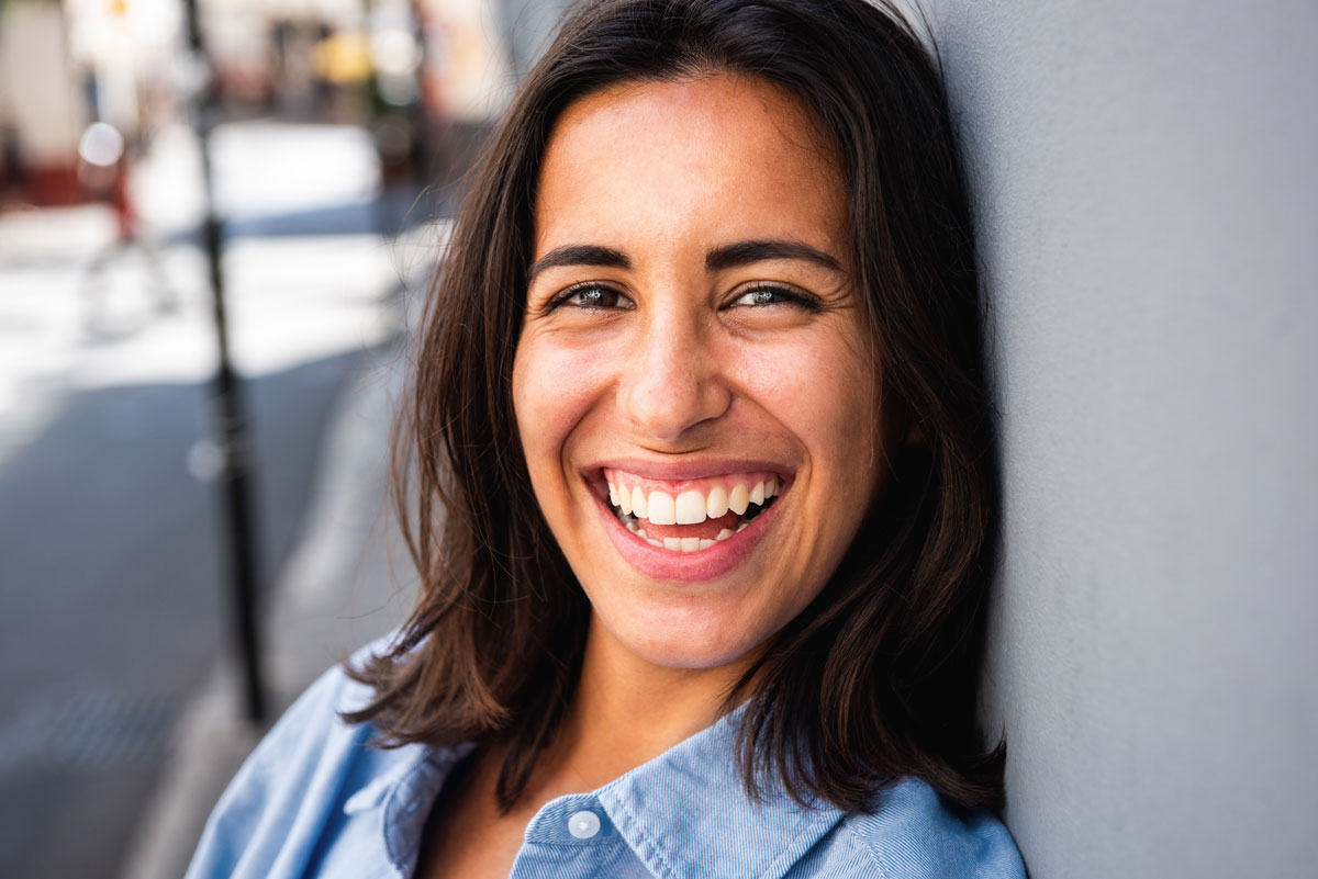
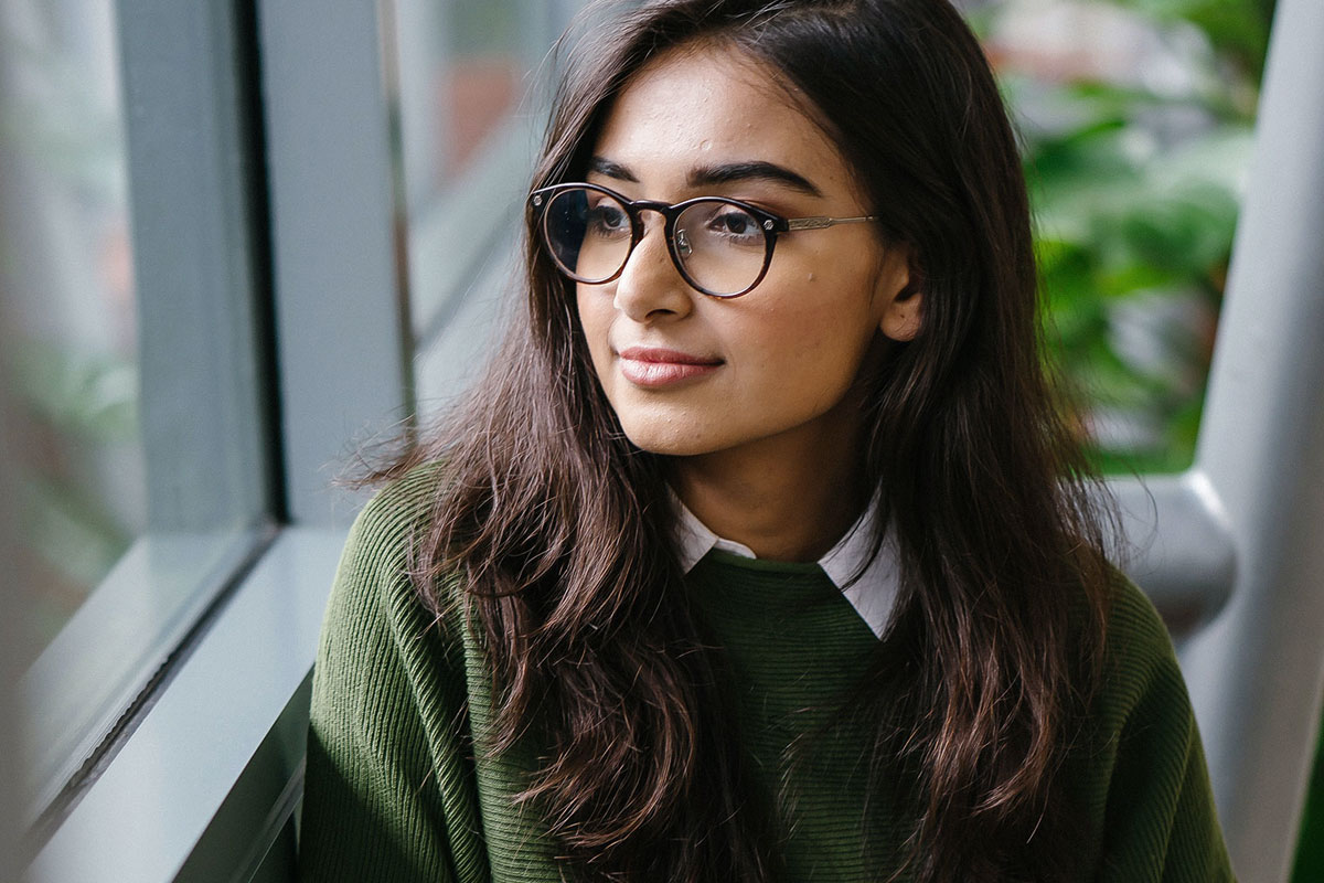
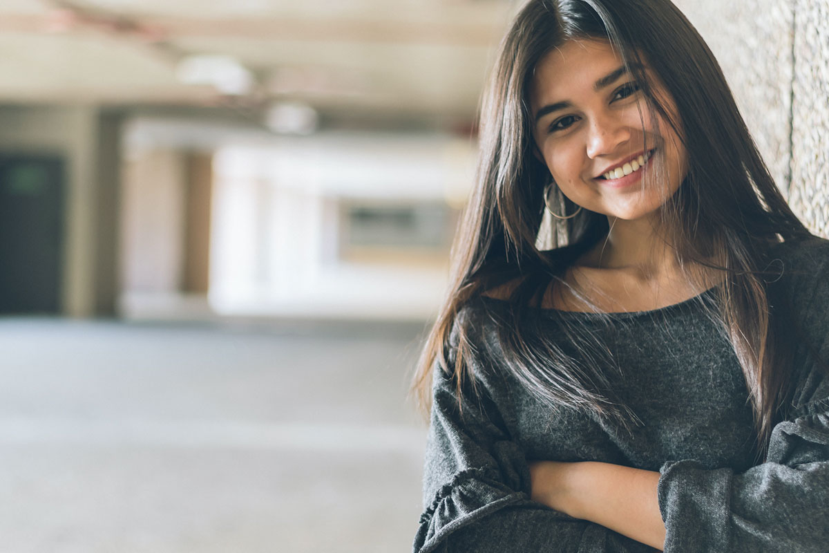
We use images to communicate closeness and empathy, reflecting in a specific style, a visual language that is close, emotional and where real people can identify with it (B).
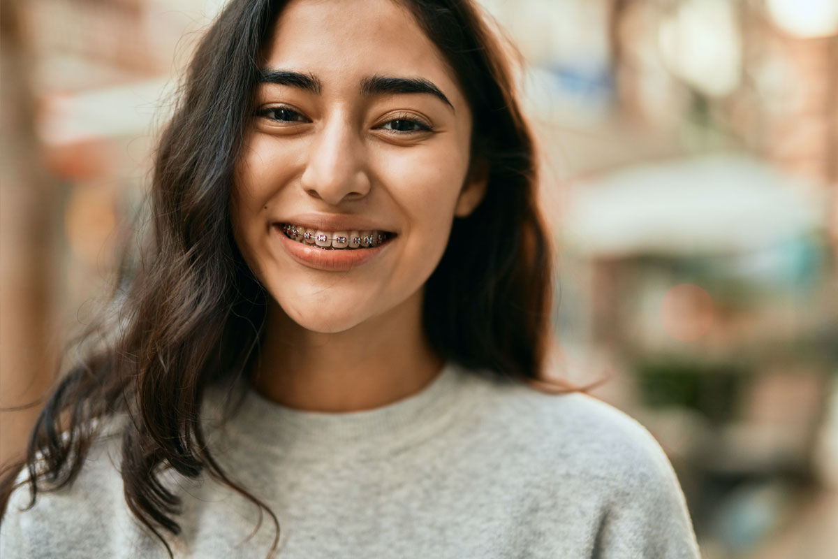
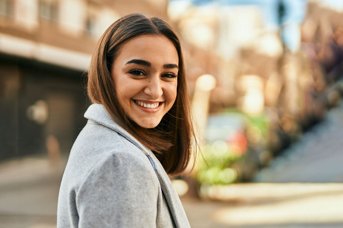
We focus on people in real life situations who share positive experiences (A).
Our style is light and natural: people without poses or forced to be in situations out of reality. We look for neutral colors in their clothing or in the background, without distractions from its clothes or from color-saturated environments.
Use natural light whenever possible, with natural contrasts and depth of focus highlighting the important elements or the people (C/D). Light is also used as an active element in our photo, sometimes to the point of a slight overexposure. Sometimes we can use green color in some element or background to give presence to our brand (C: we add a green tone with the pencil /F).


People
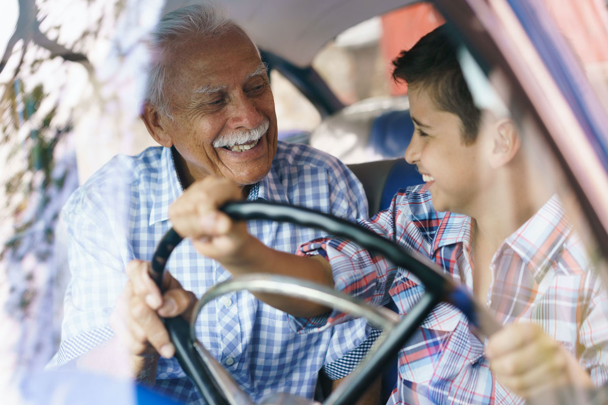
People play a key role at Utel: they add the human and warm touch while providing energy, diversity and spirit (E).
Finding the humanity in our stories helps us connect with our audience in a powerful way.
Utel people:
- Active and engaged.
- Social and interactive.
- Friendly, kind and aware.
- Open, approachable and connected.
- Empowered and confident.
Tones
Key aspects:
Light and natural colors. Avoid overly contrasted photographs as they tend to be less natural (G/G1), opt for using natural light, emphasized with authentic reflections. Brightness focuses the eye on the content and separates the foreground from the background.
Take great care of the image and be sure that the photograph is not cold but neither should give the impression of being or looking old.
Utel green is our favorite color and we can use it in different elements to have a color dominance; our palette already has a dominance of this green color, therefore, in photographs, it should be used moderately without saturating the space or the color which it is used (F).
Color correction
Avoid color saturation, excessive highlights or too much contrasting dark space. Always look for a photo that looks real, or you can correct it if necessary.
Applying an even tone to the photograph through color correction can help unify our photographic library and, at the same time, give warmth. Always aim to align to warmer tones rather than cooler ones (G/G1), though ultimately, you should stay as close to the most realistic view as possible.

Light leaks and overexposure
Light leaks are created when light goes into the image and, like overexposure, this is usually an unwanted effect, but used correctly it can add power to the photograph. In these images we can add a green tone.
Place a light leak on an image and set the screen in the effects box (we recommend screen although each photo is different and you can make use of the tool or effect that suits you best). The technique can range from intense to subtle light, but always avoid darkening an important subject or plastering it. Be careful with this use and do not apply it to faces.
Overexposure tends to show an effect with a lot of light on photos, so have especial care when selecting images that does not look old.


Focus
Blur foreground and/or background (I/K/L). Brightness helps putting the focus on the content and separate foreground and background (J). Foreground blur helps to focus attention on the most important parts of the image (K).

Use interesting perspectives, contrasts and striking image sections.
Interesting angles, foreground and background compositions also can be used. Unusual perspectives provide lines that point to the focus of the image as a different kind of composition (L/M).

Cut
Carefully cut images to focus on a topic, scene or an important detail and get to communicate with the audience in a more effective way (J).
Device
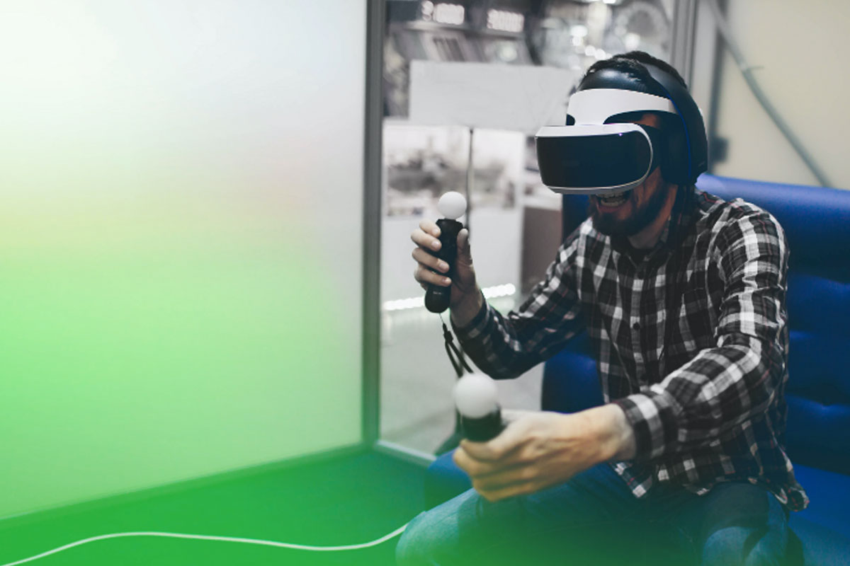
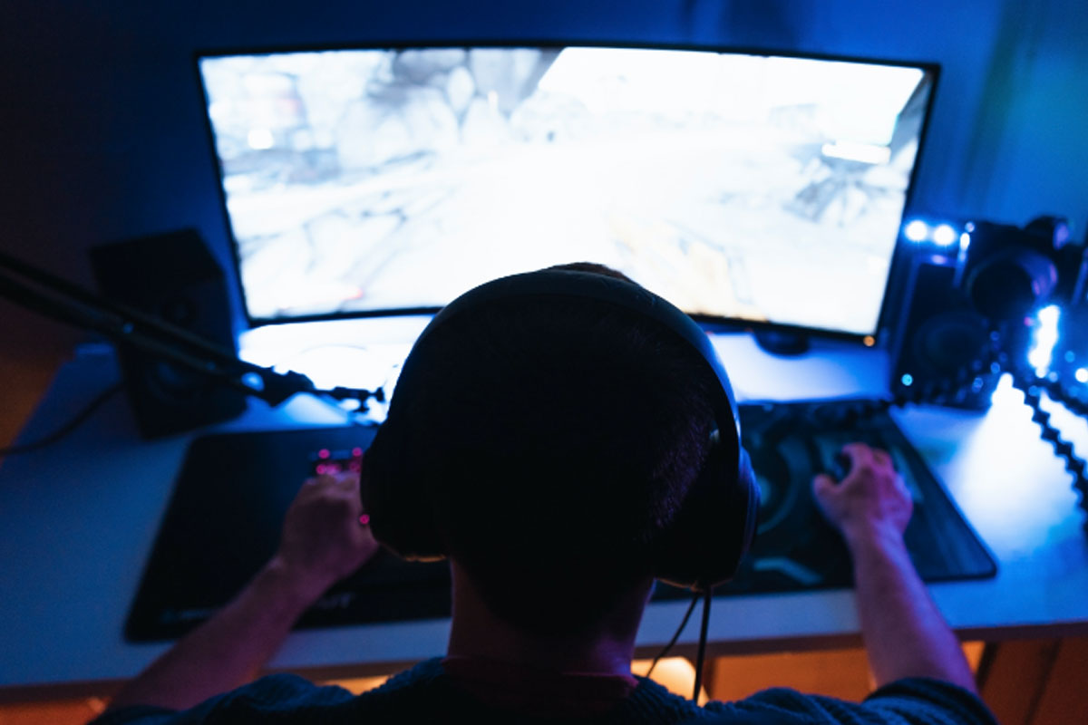
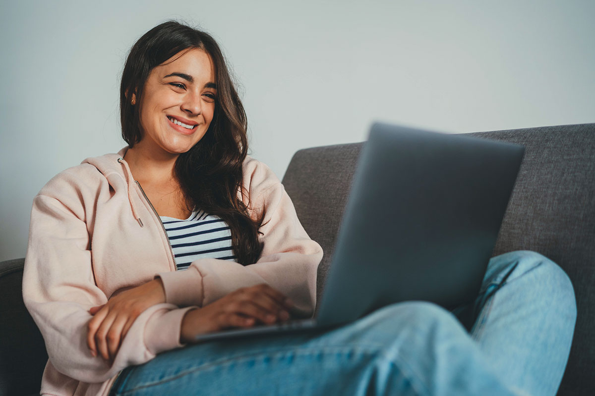
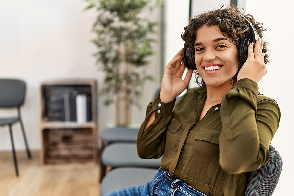
Devices are part of our digital native essence as they are tools with which we learn and connect at Utel, which is why on many times they will be part of our photos or images, however, they will never be the main focus. Always make sure that the lead of the photo is the student and not a tablet, phone, laptop or computer; these are only their tools (E/F).
Devices will only appear in the foreground or center of the image when it is a macro approach or when we do not have someone in the frame, but always prioritize the person as the most important element in your composition (P).
Utel categories:
People at front and colored background
People on a light or green background will be using the most powerful of the messages we do, always at the front with a positive and empowering attitude. Next to these photos, the brand and our isotype should always be used in one of its forms (see graphic elements). If it is part of a diptych it is not necessary to have the logo (P).

People in context
People must be in a real context with the closest focus as possible on the photo, this type of image helps when the amount of information or text needed asks us for a more open context. These photos will be used to speak directly to the users with powerful and direct messages waiting for a response.
Macro
Less is more. You can communicate in a very powerful way by making use of macro images and focusing on a very specific frame of the photo where, with a small part, you can say a lot. In this option you can allow the use of black and white as long as the image is in a context where green is present (J/P).
Brochure
Two complementary photographs may be combined with macro and wide angles to tell a story. Be sure that the difference between the two photographs is clearly visible when they are put together (P/Q).
Support images
Shots of objects and specific activities or environments can and should be used to support a given topic and, preferably, should contain people. These photos are specific - they should be directly related to the content being communicated (L).
Geography
It is important for us that people on our photos are carefully selected according to their geographic area and look like they belong to the place they are associated with (R1/R2/R3).


Permitted and non-permitted uses: