Layout
Layouts
Our design principle provides the foundation on which to build any media, whether print or digital.
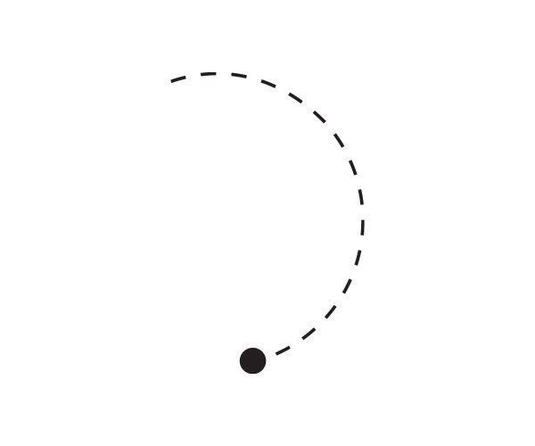
Our "organic form" is a distinctive design element at Utel. It is used in materials to highlight our brand essence, to add visual interest and enhance our storytelling.
It can also be used to establish visual focus on key functions and messages. Like our color palette, it should be used in accordance with the guide (see graphic elements). There are a variety of options for placing it on a design canvas.
Designs should be clearly structured, never overloaded and have a clear visual hierarchy. The focus is on the most important information or function.
When used consistently, these elements create continuity between families of materials.
It is important not to fall into visual monotony, that is why we give a wide variety of options to be able to execute materials.
It is important to always keep in mind the following:
Layout elements
Text (all text should always be left-aligned)
Title
Subtitle (optional)
Body text (optional)
url, benefits, highlights (optional)
Logo
Name and career (optional)
Brand graphic elements
Be sure to use at least one from the following list:
Organic shape: Background/a composition of one or more parts in stroke.
Enclosure: The shape can be as part of the layout highlighting a text (2/3), it will be used in white, in green in plaster, or in transparency always assuring text has good legibility.
Green: Inside some element in the photo, using the logo in green, etc.
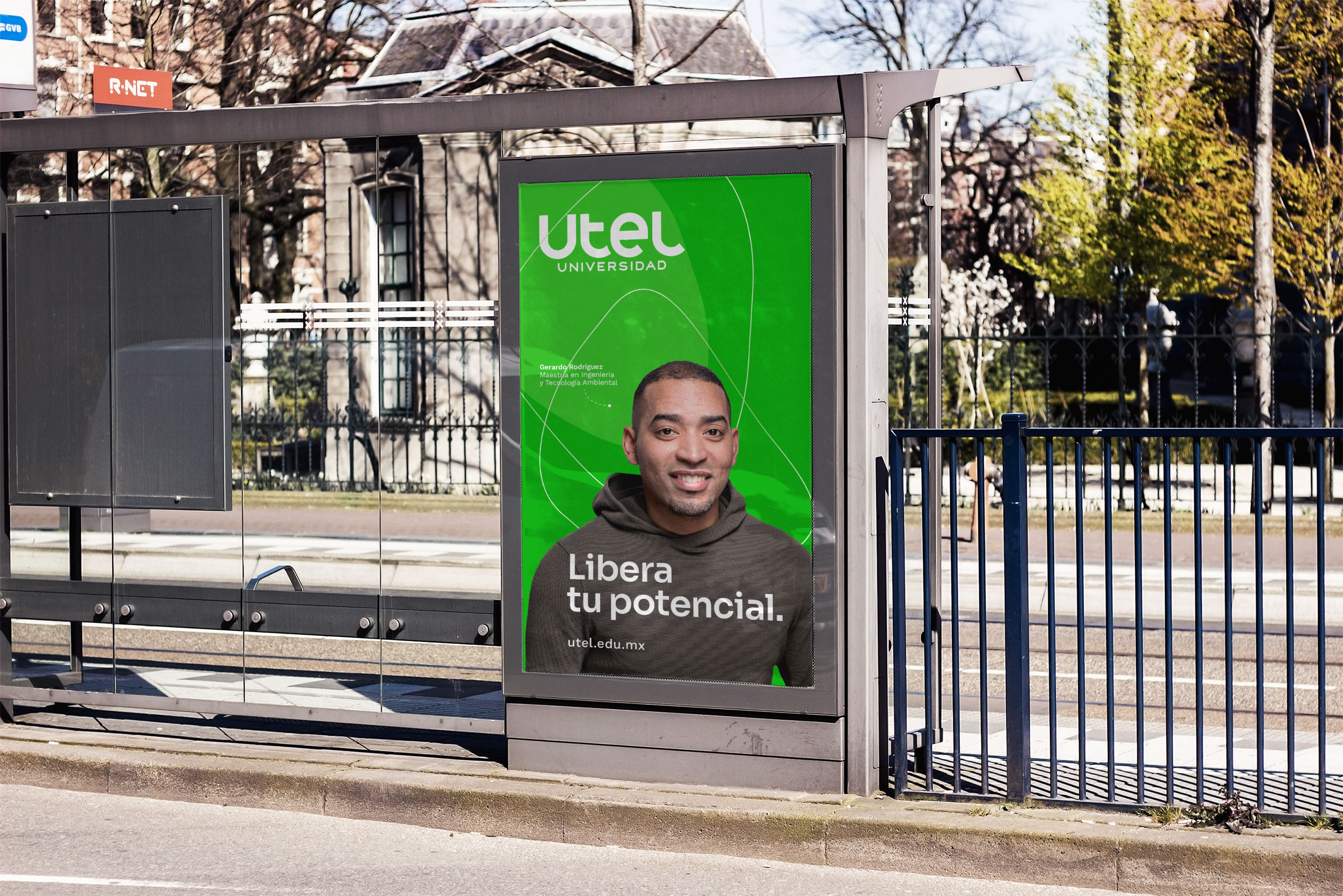
Photo
Close up
Close person
Scene
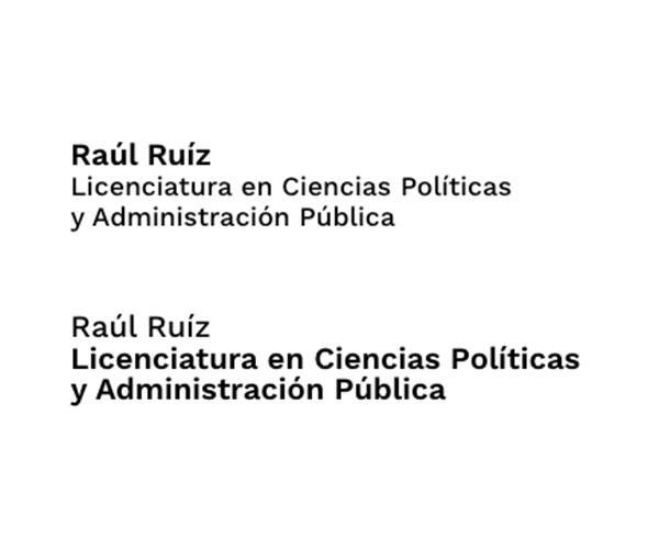
Name and career
We give communication a personal touch by naming our interlocutors and adding their characteristics in Utel, thus creating real people.
Using these characteristics will achieve a more personal and empathetic communication. On the layout it will appear the name and the career of the student. We can make hierarchies in both depending on the focus of the communication.
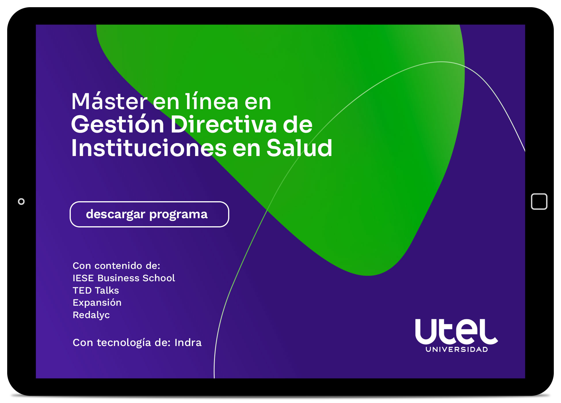
Non-photo grid
Vertical


We can use a shape in the background to highlight the text.

A shape can be used to highlight the logo.


+Recommended for partnerships and events.
Horizontal


We can use a shape in the background to highlight the text.

A shape can be used to highlight the logo.


+Recommended for partnerships and events.
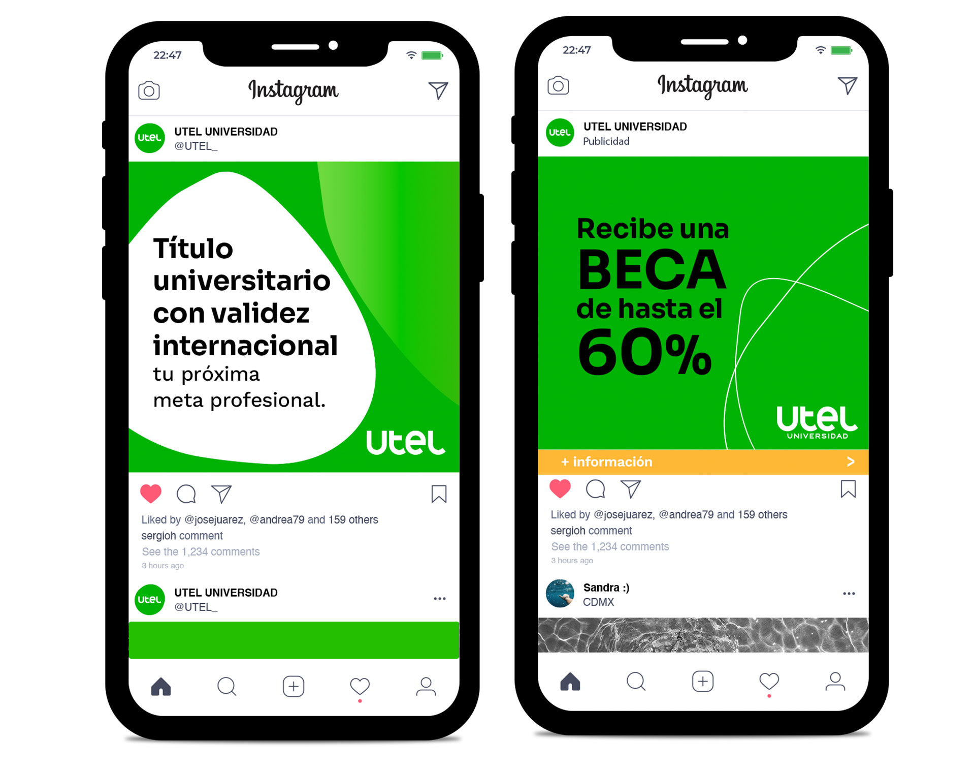
Square


+Recommended for partnerships and events.
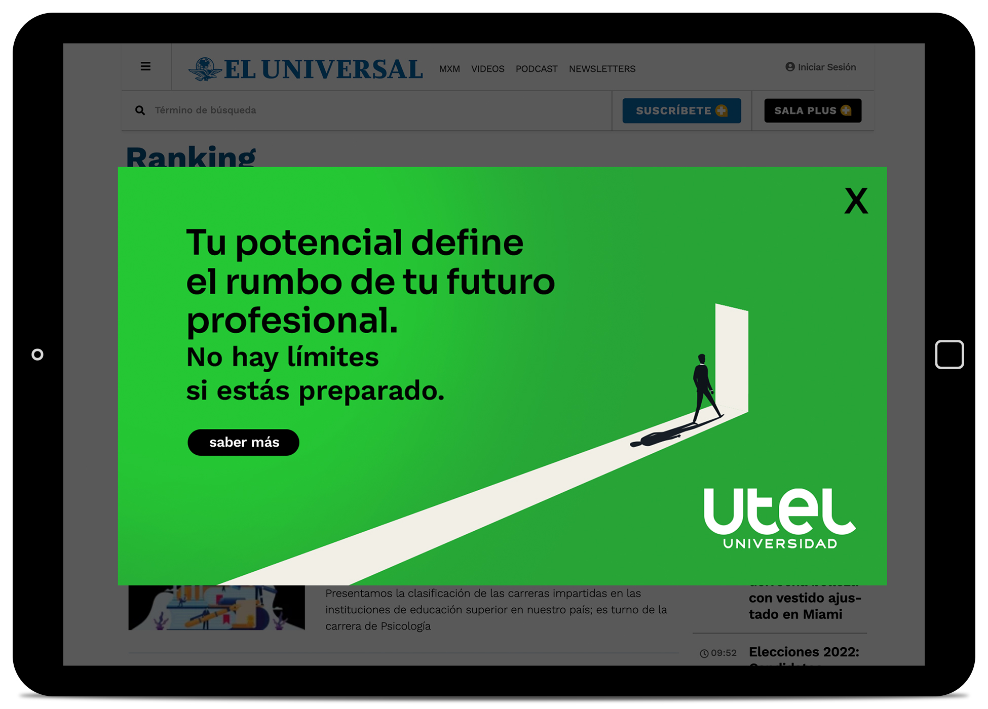
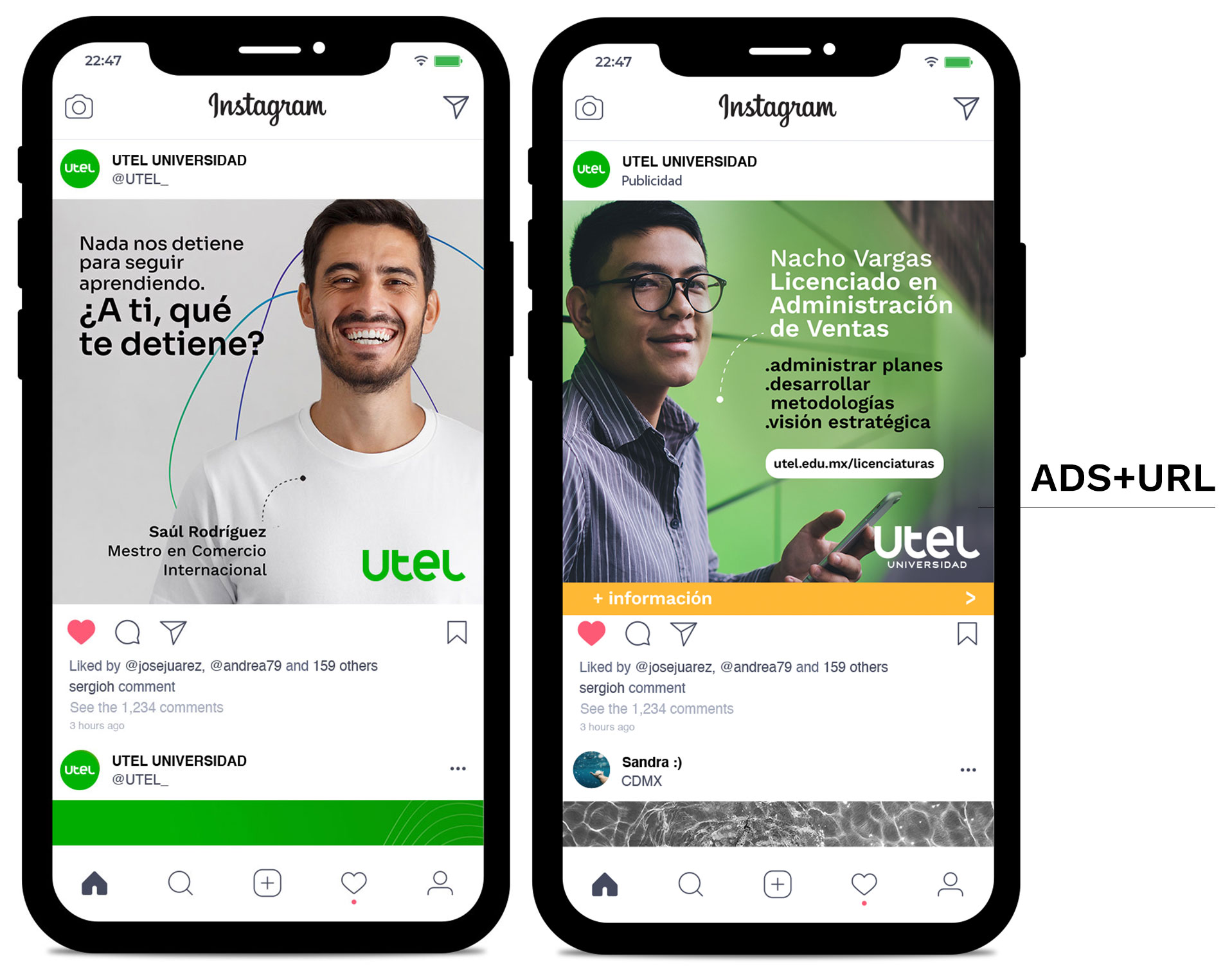
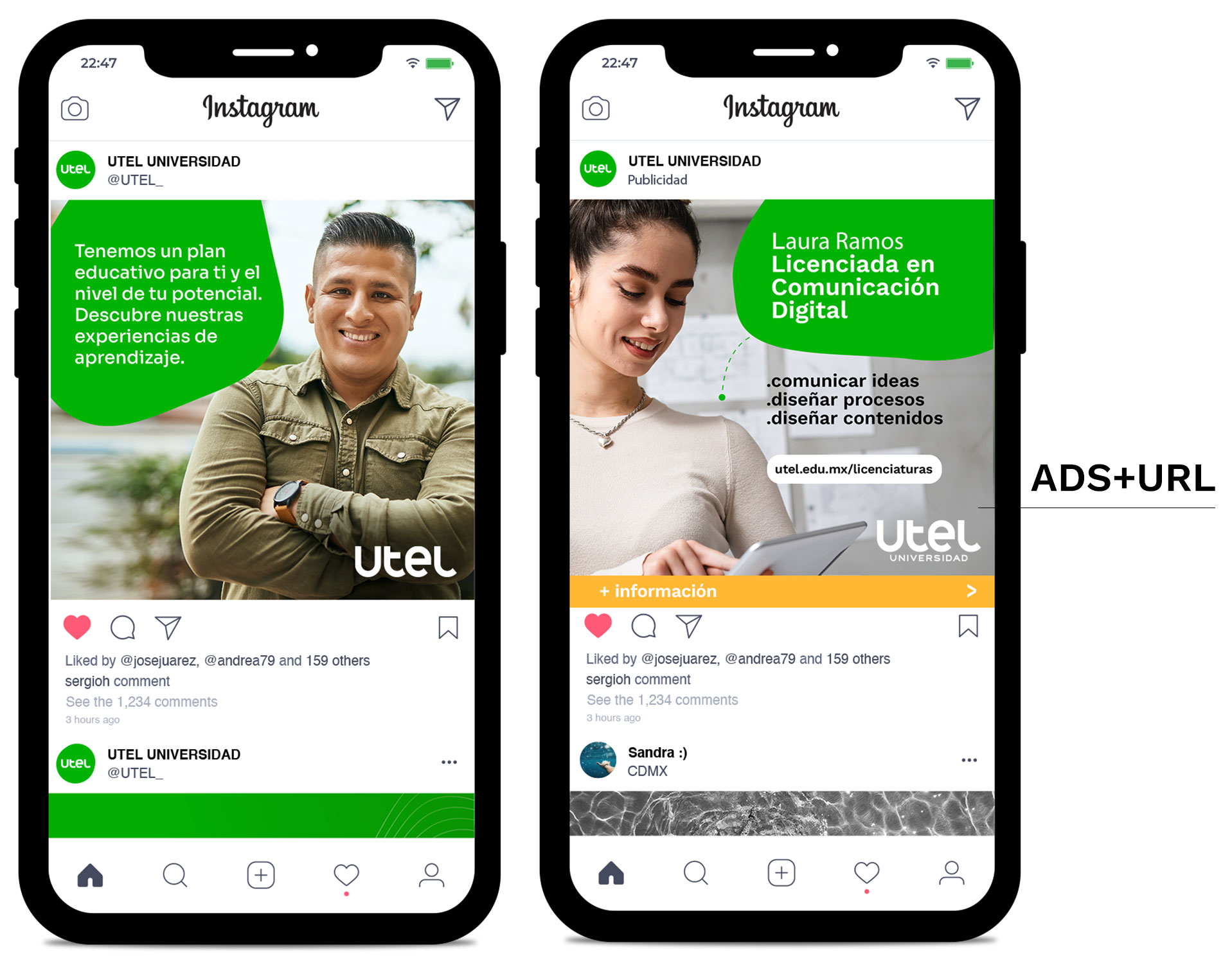
In this type of posts we will always use our logo without the tagline as it is in a Utel context, but when making ADS it is important to always use the logo with tagline, as well as the URL in the form of a button to invite users to click on it. (See permitted uses/ scale)
Person photo grid


+recommended for outdoors.


+recommended for ADS.

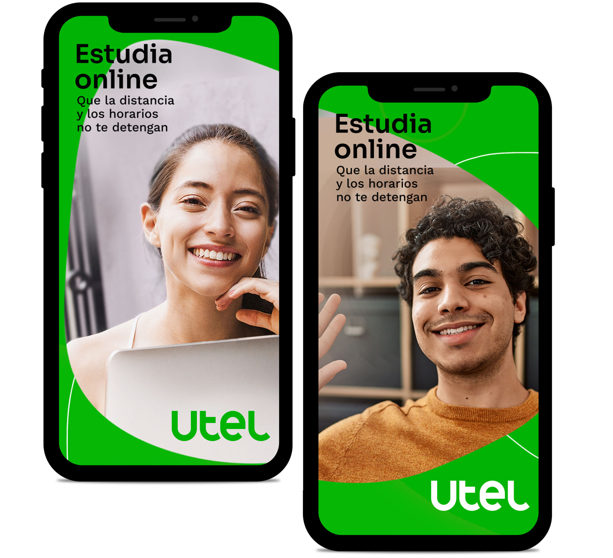
Horizontal

+recommended for headers / sliders.

+recommended for outdoors.


+recommended for ADS and text-heavy materials

+recommended for text-heavy materials.
Square


+recommended para ads.


+recommended for ADS and text-heavy materials

+recommended for text-heavy materials.
In this type of posts we will always use our logo without the tagline since we are in a Utel context, but when making ADS it is important to always use the logo with tagline, as well as the URL in the form of a button to invite users to click (Go>logo>scales).
Photo or illustration grid